Monday 30 September 2013

Parallel & Contrapuntal sound - Exorcist theme tune


WWW- 
  • Excellent choice of music, very cinematic
  • Strong example of the genre
  • Brilliant images from horror, great pace of transitions
EBI-
  • Contrapuntal images, not quite as different as they could be. Red lipstick?
  • Perhaps think about use of colour. Was the red too consistent between the two

In my opinion, I believe I could have thought about the use of colour more and red tends to represent love as well as horror. However my intention for the contrapuntal images was to create more of a passionate feel with the colour red, rather than horror. My images for contrapuntal could have been more exaggerated to shock the audience with opposition pictures that do not suit the music.

Friday 27 September 2013

Fantasy narrative using theories

Vladimir Propp - The seven spheres of action

The villain: Ronald, the princess’s evil half-brother

The donor: Jim, gives the hero a sword in his time of need for the battle

The helper: Herbert, helps Andrew defeat Ronald in the battle

The princess: Rosetta, is in danger when her half-brother returns to the Kingdom with a cunning plan

The dispatcher: Anita, informs Andrew that Ronald has returned to the Kingdom, he must save them all

The hero: Andrew, saves the Kingdom and restores peace


Roland Barthes-

Enigma/Hermeneutic codes: We find out during the climax of the narrative that Ronald is evil. Therefore throughout the story mystery and suspense is built.

Action codes: When Ronald pulls out his sword, the audience know that a battle is about to take place.

Multi strand narrative: It is not a multi strand narrative as there is only one plot built up in a single episode.

Linear pattern: The story follows a chronological order, beginning, climax and end (resolution).


Tzvetan Todorov-

Equilibrium: The narrative begins with an existing state of harmony where Rosetta is looking forward to her birthday and her half-brother visiting her.

Disequilibrium: Rosetta finds out why her brother left the kingdom, he was evil and tried to kill her father in order to gain status and become the King. A dual takes place between Ronald and Andrew the brave knight, when the Kingdom find that he has returned.

New Equilibrium: Ronald is defeated and never again returns to the Kingdom to cause harm, the Kingdom live in harmony and peace is restored.

Wednesday 25 September 2013

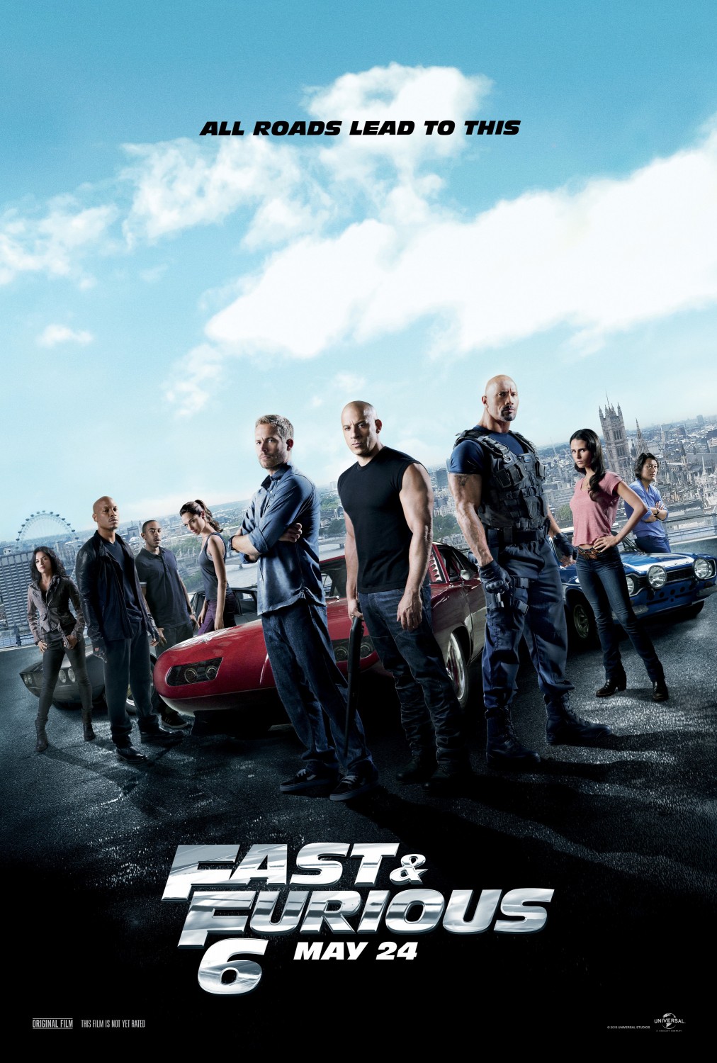
Fast and Furious 6 analysis using Theories

Fast and Furious 6 (2013)


Roland Barthes-

Enigma/Hermeneutic codes: There are many enigma codes during this movie, we tend to find out important and shocking information towards the ending of the film. For example the false hero is revealed, this builds the audience's suspense and thrills throughout the film by questioning the characters.

Action codes: Fast 6 is packed with action codes. Guns are triggered throughout making it obvious to the audience a scene of violence and a fight/battle is approaching. Also, when we hear or see an engine roaring we know a car race will be taking place soon after.

Multi strand narrative: This is the sixth fast and furious, therefore the movie has follow ups and the story continues to develop.

Non-linear pattern:  The film is in non-chronological order.

Tzvetan Todorov-

Equilibrium: Dominic Toretto (hero) thinks peace is finally restored and is enjoying his life with his new girlfriend.

Disequilibrium: Hobbs (dispatcher) informs Toretto that his true love Letty has been found, however he thought she was dead. He learns she is with a new team lead by Shaw (villain).

New Equilibrium: The hero ends up finding and saving Letty and learns she lost her memory. They soon get back together and the evil forces (villains) are defeated so harmony exists once more.

Vladimir Propp - The seven spheres of action

The villain: Shaw, has the princess on his side (team).

The donor: Hobbs, gives the hero evidence in order to find the princess.

The helper: Brian O'Conner, the hero's bestfriend, accompanies him on missions to save the princess.

The princess: Letty, rescued by the hero, loses her memory and forgets everything.

The dispatcher: Hobbs, informs the hero of the mission.

The hero: Dominic Toretto, saves the princess, his love.

The false hero: Riley, pretends to be on the hero's side, however turns out to be helping the villain all along.

Film Noir lighting style


Film Noir has a literal translation of 'black film'. It is typically set in the early 1940's to the late 1950's. Film Noir is a visual style, with roots from German cinematography. It is usually the genre of some sort of a crime drama. It consists of low-key lighting and unbalanced compositions. This creates moods and expressions from the shadows and silhouettes that are created. This then creates a sense of mystery. In terms of lighting, bright lights focus on and capture characters eyes, shoulders, hats and the face in order to create stark shadows for criminal lighting. The overall lighting is quite low-key, with high-key lighting every now and then usually to symbolise a meaning and create effects.


The lighting used for this image is low-key lighting. Although we can tell this is natural light as the male figure is standing next to a window and the light seems to be coming from the sun outside, dramatic shadows are created with only a key light and back light. The effect is known as chiaroscuro. In this particular image, we may assume that the key light is possibly coming from the left side as his face is brighter and most influential. This means the there may be a less bright back light is on the right to help create shadow, with no filler light as the shadows are quite sharp. 

Moreover, the underlighting used helps create a more mysterious effect. As he is holding a pistol and peering outside, the audience may assume he is waiting to shoot someone. His hat also helps to make him look more of a character of mystery as he may be some sort of detective, those are the usual connotations we would pick up from this image due to the props used. This image successfully fits the purpose of a film noir and we can tell straight away due to the black and white colour, the mysterious mood created and often, half his face showing with light.


'The Third Man' is a British film noir set in 1949. This clip mainly uses high-key lighting as it is set outdoors, therefore the lighting looks natural and filler lights are also used throughout. However the movie still looks quite dull. Shadows are created in this scene using key lights and back lights. 

The first major and obvious lighting used is to show the different zones, the signs say American zone, British zone, Russian zone and French zone. The lighting used on these symbols could possibly represent meaning. We can see that the American zone sign is bright and well lit all over, possibly conveying a message that America is good and trustworthy. Next, the British sign is readable, but has shadows on it created by the lighting and gate beside it. This may be to portray a message of mystery and that some of the British are good and some bad, or somewhere in the middle. Similarly, a shadow is cast on the French zone although it is slightly faint, therefore has less of an effect. The Russian sign has the same lighting as the background is not any brighter or dimmer, this could mean that they blend into the back and the soldiers don't really stand out or go out of their comfort zones. The places can represent the countries as well as messages about the soldiers as that is what the clip focuses on during the first few seconds (29 secs). Furthermore, towards the end of the scene towards 1:47 mins, as the male figure rushes up the stairs, the top lighting creates a shadow on the wall of the silhouette and staircase. In the shadow we focus on his briefcase and hat. This creates a sense of mystery as we wonder what reason he has flown in to the country for. We see him check in with his passport just before at 1:30 mins. This film obviously represents a film noir as it obtains all the features and lighting effects. 

Monday 23 September 2013

Stuart Hall's Theory - Encoding/Deconding


Stuart Hall (1980) discovered the theory of encoding/decoding. Hall discovered different types of readings and came up with a theory in order to describe the effects media texts have on an audience. Firstly, he discovered the dominant ideology, typically known as the 'preferred reading' in a media text. This is what readers,viewers and listeners are lead to believe, but do not necessarily have to believe. This is done by the way something is portrayed in the media. Secondly, the 'oppositional reading' are conflict ideas with the preferred reading. This is where ideas of an audience do not meet the creators intentions of the media text. Finally, the 'negotiated reading' is a non bias view, where the audience take both preferred and negotiated readings into account.

Hall's ideology has been criticised, for being 'at the expense of the importance of ownership and control' - Stevenson 1995:35.

News in the media


Police say they are "closing in" on the militants at a Nairobi shopping mall who have threatened to kill their remaining hostages.


Dominant reading: The intention of the creator of this image is for the militants to be helping save hostages and to portray them as positive and doing a good thing. The image presents them as determined and focused as all five of them are lined up ready for their mission. Their goal is to secure safety and protection for members of the country.

Oppositional reading: On the other hand, one could argue that the fact that the media are there is invasive, and is actually more of a money making scheme. Therefore, this could provoke more terrorist attacks against the country, instead of actually help making people around the world aware of it.

Negotiated reading: One may say that although the media are attempting to help by making the public more aware of the attacks in Kenya, they may be antagonising terrorists even more as they are now getting publicity from the media all around the world.  

Sunday 22 September 2013

Mise-en-scene comparison


Avatar


   Scream 4


P.S I Love You


Costume and Make-up: Avatar is a adventure animation, therefore the costumes are of animations and make up is of virtual looking beings. However, with the humans in the trailer, battles occur and make up is used to make them look as though they have been injured and bruised. Moving on, Scream 4 is a horror. The costume of the main character is plain black and has a white mask, this is the killer in the movie. Make up is again used to make characters look as though they are bleeding and dying. Finally, P.S I Love You is a romance, costumes for the main characters are quite modern. The woman wears dresses and skirts, the man wears trousers and tops. This gives a casual feel to the movie.The make up is also quite simple, so giving the film can relate to reality and be modern.


Lighting and colour: To begin with, Avatar uses quite technical bright lighting and common colours such as blue for effects. Lighting is used to show blasts and blow ups as well as the trailer being quite generally bright the whole way through. Scream 4 uses a lot of black and red to connote murder and death, emphasising the fact that it is a horror. The lighting is quite dull during scenes of death. This done to create mystery and not to give away too much information to the audience in order for suspense to remain. P.S I Love You uses bright lighting and colours of red and white throughout the trailer. This is to create a sense of love and purity. The female wears a red dress and shoes at one point of the trailer, showing that she could be the main character in the romantic lead. 


Setting and Props: Firstly, Avatar is set in  a research lab as well as a whole other island and universe called Pandora. The props used to make it obvious it is an adventure are planes, helicopters, guns etc. On the other hand, Scream 4's main prop is a knife and telephone. The telephone call is used as a symbol of an upcoming murder and the knife is used for the actual murder scene. It is set in homes and schools to make it more like a reality. Lastly, P.S I Love You similarly set in homes to make it relate to everyday life, and uses love letters, couples etc to make it obvious it it of the genre romance. 


Actor placement and expression: Furthermore, Avatar uses the main character in a wheelchair facing hefty machinery, therefore we assume there will be some adventure, challenges or thrill. Scream 4 shows the three main characters from the previous Scream, so we instantly know the same cast will be starring, drawing in fans of the film already. The two in the background facial expressions look fearless, however the main one in the middle looks the opposite, this suggests some mystery and terror. To end with, P,S I Love You shows five characters from the movie looking quite casual but confused also. This suggests a twist in the romance.


Still image mise-en-scene analysis


Costume and make-up: We can instantly tell from the costume that he is a superhero. His armed suit makes it obvious that he is protecting himself from a battle or fight. His make up is quite dull, and he looks as though he has bruises on his face, which again reinforce the idea of some kind of fight.

Lighting and colour: The bottom half of the image is much brighter than the top half, possibly portraying a message of good vs evil, showing the villain in the background and hero (iron man) at the front. There is also a bright light on the main characters center of the body. This could be a symbol of the character being hope as he is the hero or emphasise his importance in the image. The colours used for iron man's suit are red, gold and light blue. These colours represent his importance, power and innocence. The background colours are blue, orange and pale yellow. These are quite similar but the orange fire represents danger, which is what the villains represent.

Setting and props: The image is taken outside, which has a greater effect as it allows the picture to capture even more villains from farther away. This makes the hero look even greater as he has to take on seven villains alone and gives him more of a heroic look. The UFO is used as a prop. It looks as though the villains have flown out of it. On the other hand it gives the image more of a mysterious look, as it also looks like something that has crashed and is on fire.

Actor placement and expression: Iron man is placed at the front of the image. This immediately gives him power and dominance over the other characters in the background. He looks as though he has just landed onto the ground, so the shot has been captured while completing a mission. The fact that his right hand is visible emphasises this point, as his suit is not covering his hand. His facial expression is quite determined and he looks as though he is focused and ready to complete his mission.

Wednesday 18 September 2013

Nina Ricci print advert analysis


Colour: The feminine shade of pink instantly makes it clear that the advertisement and product is targeted towards females. The colour pink connotes compassion, nurturing and unconditional love.
It makes the audience feel as though the product is very gentle and subtle. The colour conveys an image of the perfume as being innocent and the female also as she is dressed in a baby pink dress with white flowers around her, connoting purity.

Framing: The female is surrounded and framed by four mirrors reflecting images in the room, including her. Also, she is holding the perfume bottle behind her as well as it being places at the tail of her dress in a larger print. Moreover, two trees are placed next to and behind her which creates quite a feminine and innocent feel as it adds white to the  image.

Composition: The image has been composed with the female on the right side of the print, using the rule of three thirds. This draws more attention to her and creates a sense of importance not only to her but the perfume bottle also, placed on the opposite (left) side of the print. All the images in the print blend well together due to the similar shades of colours.

Size:  The perfume bottle which is the actual product is not the largest image on the print, however it is placed the closest to the camera which draws attention to it. The text is small compared to the images, however the Brand name is clear and visible. The slogan on the other hand is not.

Type of shot: The overall print is a long-shot and slightly low-angle, this includes the female, trees, flowers and mirrors. Although, the actual perfume bottle shot is a straight on, close-up. This has been done to make the advertisement look empowering, encouraging women to buy it.

Subject matter:The purpose of the print advert is to promote the Nina Ricci perfume. The product has been surrounded by feminine colours and images.

Setting: The photograph has been taken indoors. It looks as though it is a bedroom with white walls, mirrors, trees and the product. The white emphasises the purity of the product. However the pink and silver adds a sense of femininity and class.

Lighting: The print is very bright and has white light added to the whole image. The background has shadows, possibly portraying an image that the female in the shot has come something negative, but is better now that she has the perfume. The mood is positive as it is promoting the product.

Pose: The female in the image is holding the perfume bottle behind her, as looks as though she is hiding it or has a secret. Her facial expression is relaxed. The pink flower like dress and wavy hair adds to the feminine touch of the image. The product appears three times on the print in a subtle way. It is clearly displayed at the front, then is shown much smaller in her hands and reflection from the mirror.

Connotations: The constant colour white connotes purity and innocence. It could have a deeper meaning that the perfume actually smells quite floral. The way the image has been presented almost makes the audience feel as though they are in a fantasy. The tress coming out of the mirrors is quite unreal.

Audience: The product is aimed at females who are teenagers and adults. The product is priced at around £30-£50, therefore would be appropriate for a middle class audience at C1/B on the social demographics.
Saturday 14 September 2013

Iphone 5c analysis


Media language- The sophisticated vocabulary used makes it obvious that the Iphone 5c is a luxury. At the beginning of the video the words used to describe the phone are 'simple, essential and capable'. This immediately appeals to the audience as it a carefully designed phone which appeals to everyone as it is made to look easy to use. The word 'essential' makes it seem as though the phone is a must have and encourages the audience to want and buy it. In addition, 'capable' seems as though the phone itself is capable of doing anything, making it stand out and differentiate from rival phone company's and make it look as though this Iphone is the best one yet. Overall, throughout the video the language used makes the phone even more desirable to the audience, again encouraging them to buy it. Another key word used is 'quality', which they ensure all their Apple products have.

Ideology- The ideology behind the Iphone 5c promotional video is to make it seem more desirable than it actually is. The design of the phone is focused on throughout the video and close-up shots are continuously used of the phone and all the different angles to it. This is to engage the audience more in to the product and portray an image that it is a simple, beautiful design and it is easy to use with no complications. Essentially, this is what any consumer of a phone is looking for, therefore Apple have purposely presented the phone in this way. Apple have also used plastic instead of glass for the first time in their Iphone, they want consumers to feel the quality of the product and make it more durable as it is less likely to break. Apple also make sure they portray an image that although the Iphone 5c is plastic and cheaper, the quality is no less than any other Apple product.

Genre- This advert is persuasive and informative. The purpose is to make consumers aware that the latest Iphone has been released and states why people should have it. The key conventions that make it obvious that the advert has been released to persuade is mainly the language used. It also shows people actually using the phone and presents the product in a positive light as they look quite happy and pleased with it, therefore consumers of the Iphone would be also.

Representation- The Iphone 5c has a modern representation. We can tell by the range of bright colours the phone is available in. It is giving a message that the new Iphone is fun and quirky. The range of coloured cases also show that Apple are not afraid to be different and try something new. The continuous white background that all Apple products use presents iconography that it is simple, clean and modern. The close-up shots of the phone really give the audience an insight of the product itself, it is presented as a carefully designed phone which is appealing to everyone. To continue, the fact that the first speaker is British, represents class. The second one is American who explains more about the technological side and functions of the phone. This presents an idea that the Iphone is worldwide and aimed at everyone, not only the UK.

Audience- The Iphone 5c is clearly aimed at an AB audience according to the social demographics. It is mainly targeted at a Chinese market as they love their bright colours and enjoy the latest technology/features and are always on trend. However, it is also targeted at people worldwide. Anyone who enjoys a luxury lifestyle, bright colours, fashion and is a trend setter would love the Iphone 5c.

Institution- Apple always without fail aim produce and offer quality products with an experience. They target a world wide audience and try to make their Iphones appeal to everyone. The Iphone 5c was released in September 2013, therefore they aim to incorporate the new Iphone into a modern society and meet current expectations and needs of a phone. This has been done in a several ways including; the design, colours, shape, materials used, functions, features and price etc.

Narrative- This promotional advert shows the Iphone 5c being used in a number of ways. Firstly, it begins with the phone itself on a plain white background, immediately creating awareness of the beauty and design of the product. It then shows the range of different colours soon later, showing what Apple have to offer. Furthermore, it continues to present the Iphone in the the manufacturing process. The intention of this is to emphasise the bespoke product and the quality of the design and materials. It also enhances the fact that the Iphone has been carefully constructed, showing that Apple take pride in their products. The manufacturing process allows the audience to engage in the product being created and almost makes it tangible, due to the vocabulary used. The video then goes on to people actually using the phone; by playing games, using facetime, new features, the 8 megapixel camera etc. The whole purpose and intention of this video is to engage the audience more than anything, and make them feel a part of the new, exciting experience.

Wednesday 11 September 2013

Insidious 2 Trailer Analysis


'Insidious 2' is a horror movie. The trailer has key conventions which make it obvious to the audience that it is of this genre. This includes clips and connotations of the supernatural activity and beings, fast pace music, a nuclear family moving into a new house, blood, candles, murder etc.

The trailer begins with the happy family talking as though all their worries have gone away and believe they are safe now. However, soon into the trailer by 28 seconds, the mother begins to witness abnormal activity in the house, for example the baby's walker moving and lighting up on its own. She then see's a pale woman on her sofa and hears a female voice singing nursery rhymes in the baby monitor. Although nursery rhymes are usually innocent, they can be easily manipulated into sounding scary also. We then see a skull and dolls, which in terms of horror connote death and possession.

We then witness a fast pace sequence of events where it is clear the family are trying to save and protect each other from the non-humans. Finally, the trailer ends in a climax where the father is told by a scary looking old man, 'he's got your baby.' This of course leaves the audience feeling anxious and thrills them to want to see the movie.

I believe this is a typical horror trailer as not only does it consist of typical conventions and connotations, but it leaves the audience feeling off edge. Furthermore, the story line is how a horror is usually laid out as the family work together in order to get rid off the bad omens in their home, then come to a thrilling climax and relieving, peaceful end.

Sunday 8 September 2013

Introduction to Media Studies

I chose Media Studies as it has always been a subject I have enjoyed and felt passionate about during my GCSE's. I am interested in the practical side to media, including film making and print design. To continue, I also love to write so I feel Media is the right subject for me as I will enjoy the written side as well as the practical. I am also very creative so I feel it combines the two together quite well.

Throughout my AS course I hope to become knowledgeable and skillful not only when  it comes to being able to produce a piece of work, but also more aware of the actual media. By this I mean the way the media portrays certain things to the public, which is why stereotypes possibly exist.

Furthermore Media Studies compliments my other AS, Applied Business, therefore I feel both choices go well together and can be used in the future. I hope to develop a career in Business and feel that Media would incorporate with what I do.