1) Below are magazine covers that I have picked out that target an E4 audience and have cover lines that could be used for my own magazine as they relate to the serial killer theme.
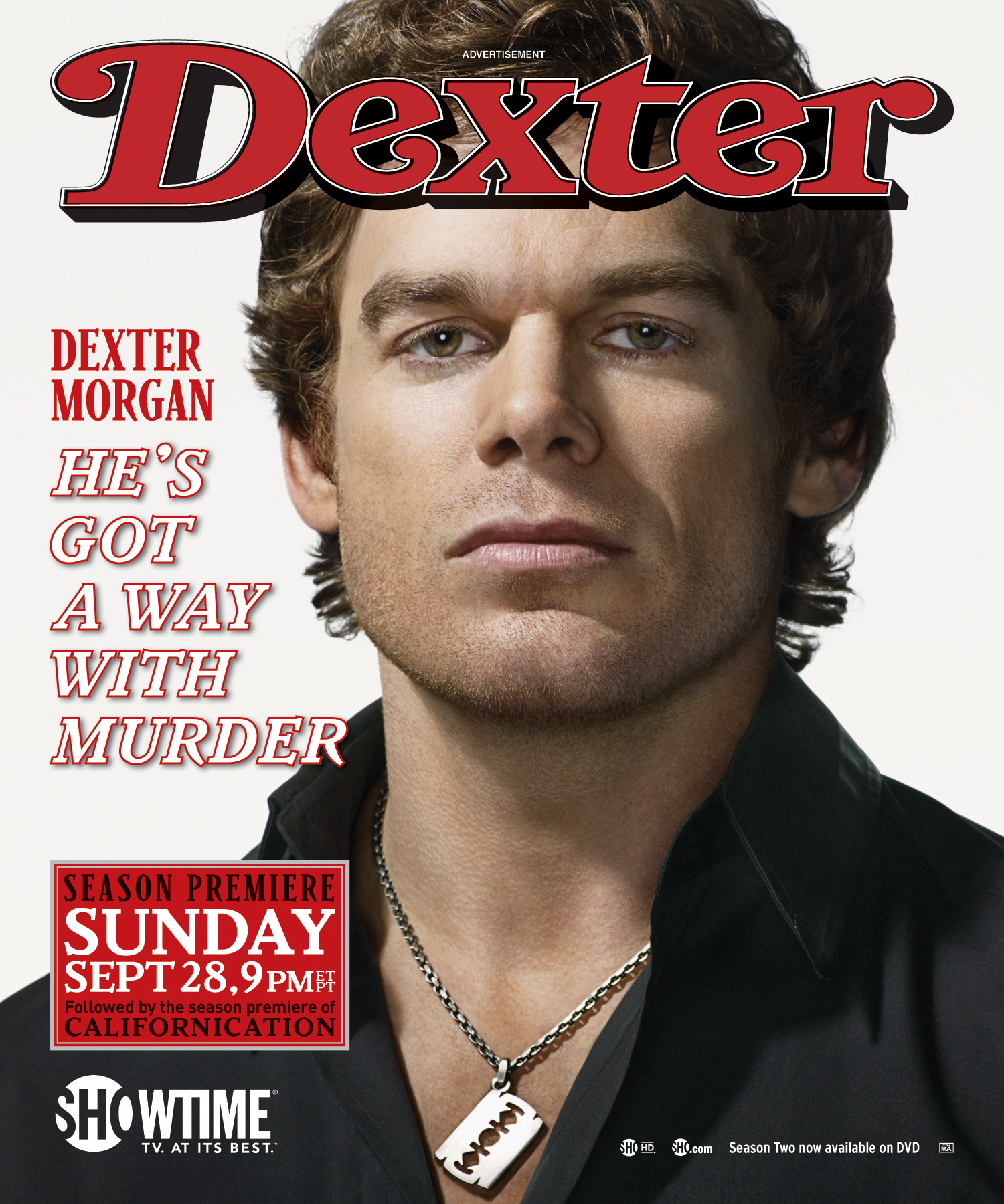
The cover line 'He's got a way with murder' is a play on words about the character and a similar cover line could be used for my magazine.

The celebrity appeal of Sherlock Holmes targets an E4 audience as it has an interview with him inside. The detective/murder theme is also in my productions narrative.

The 'killer good looks' cover line could be used on my magazine cover as a play on words, which interests the audience.

Although Doctor who is broadcasted on BBC, it would be popular with an targets an E4 audience due to the narrative. The interview with David Tennant could go on my magazine as Doctor who has similar themes to my narrative in some aspects.

The cover line 'find that perfect cut' could be used for my magazine. This magazine targets a female E4 audience.

2) This Supernatural souvenir magazine is a special collectors edition and can be purchased online. It celebrates six seasons of the show and contains 148 pages, packed with highlights from seasons, interviews with main stars, the shows creators and behind the scene specials.
3) This Doctor who magazine cover has several key conventions:

1) The title of publication is Doctor who. It is written in bold in grey/white writing and blends in with the background.
2) The slogan is 'celebrating 50 years of adventures in space and time'. The '50 years' is emphasised as it is in a larger font and a different colour to the white writing. This slogan catches the readers eye and sums up the magazine by hinting clues of what could be inside e.g. history from the show to now.
3) The central image is the main star of Doctor who. However it also includes two other characters on the side. The fact that Matt Smith is in the middle suggests his importance is greater than the characters beside him and as he is more well known in the show, it catches readers attention more.
4) The main flash/cover line is 'the day of the doctor'. This is written in large white bold writing on the main characters chest, making it more eye catching for the reader. Another line above it is 'the doctor's past comes back to haunt him'. This could relate to the slogan of celebrating 50 years of Doctor who and shows the magazine will include history related context of the show.
5) This Doctor who magazine includes 12 collectors anniversary art cards, 9 downloads of Doctor who audio adventures and a chance to win Doctor who blu-ray ray dvds, books and cds.
6) The main colour scheme for this magazine cover is white, black, gold and red. The white writing emphasises the boldness of the writing and helps it stand out. The red and gold colours are eye catching together and red connotes the detective theme. The black/grey background creates mystery for the main character as his facial expression looks mysterious too.
7) Along the right side of the magazine, the name checks show what is included inside the magazine and what prizes readers have the opportunity to win.
8) The language on the cover has a lot of repetition of the word 'doctor'. Although the show is called Doctor who, the main star is a doctor also, therefore the show Doctor who is more likely to stick in the readers mind. The language is short and snappy and easy to understand.
9) The font is mainly bold for the title of publication and flash/cover line. These are the most important pieces of information for the reader as it tells them which magazine it is, and the cover line hints what is going to be inside the magazine. The font is small for other information which is not as important e.g. competition chances.
10) Competition opportunities are listed on the right side of the magazine where a chance to win Doctor who dvds, books and cds are available inside the magazine. This is important as it gives readers an opportunity to interact with the magazine.
11) This magazine cover does not directly state 'you' to the reader when showing a message to them, however the competition inside shows readers they have a chance to win.
12) The barcode is placed at the bottom right side of the magazine and shows a clear price and issue number for readers information.
13) The real target audience for this magazine is everyone from the ages of 13 and above of as it is a pre watershed show which is suitable for families. I believe that children from the age of 15 however would read this magazine up to the age of late 20's.
No comments:
Post a Comment